Blinded review of safety laboratory data can be an onerous task. There can be close to 50 laboratory parameters distributed in just the typical hematology, chemistry and urinalysis panels. A review of tabular summaries of the measures of central tendency, shift tables and marked outliers for blinded data as part of dummy randomizations is not helpful. A review of the listings for shift tables and marked outliers may be useful to identify individual patients. But this can be a long-drawn, tedious process.
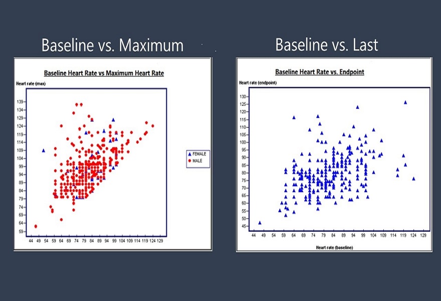
We have found it most useful to plot a scatter plot of baseline on the x axis versus the post baseline on treatment last or worst value on the y axis, using the same scale for both axis. It also helps to draw lines parallel to the x and y axis to divide the scatter plot into four quadrants.
The scatter plot of baseline versus last on treatment is particularly useful. It gives us an immediate sense of how patients are doing as they complete treatment. If the scatter plot forms a diagonal line, we can be reasonably certain that at the end of treatment patients were, in general, no worse off than at baseline from the perspective of their lab parameters. If we divide the plot into four quadrants at the upper limit of normal for the parameter, then we know who has shifted quadrants and by how much. We can also draw a line for the end of treatment parameter at say, two times the Upper Limit of Normal, to identify outliers – patients with significant shifts for the lab parameter.
The scatter plot of baseline versus worst – highest or lowest is also useful. It gives a quick sense of what happened during the treatment period. We can divide the plot into the same quadrants as for the baseline versus last.
It is good to have these scatter plots programmed early in the development program and execute them frequently, so that real time review of laboratory data is possible. The only hitch is, most often the lab data is housed at the central lab. The central labs do not usually provide a useful dashboard to create and execute scatter plots on a regular basis. Another option is to have the lab data migrated to the central database at frequent intervals and use a visualization tool there.
The one problem one can run into is if the lab normal ranges differ between patients, in which case one may need to normalize the lab data prior to creating the scatter plots.
For more blogs, please visit: https://www.rxmd.com/insights

